reeves2002
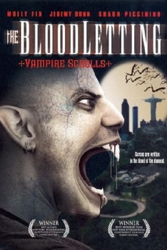
I was really drawn to the cover art because I love horror movies and especially vampire movies if their not cheesy.The beginning when the credits were rolling was intriguing.I really liked the spooky music.The red candle,the images in the book and the vampire scrolls created a very nice dark Gothic atmosphere and mood.And then you see 2 girls walking down the street and the whole movie changed.It went from feeling like a genuine horror movie to a daytime soap opera because of their bad acting.Fortunately the movie picked up and I started to get interested again.For a budget that was low, the special effects were quite good.The actors looked more like models so this is probably why the acting part of this movie was lousy,but it was interesting enough to keep me wanting to see what was gonna happen next.The British guy made me laugh and the vagrant was a real character even though he didn't have many scenes.This movie finished with a sequel in mind according to how it ends.With a bigger budget it could be bigger and better!
poemsoflife
I liked the film. It was a common low budget film, hard to watch at some points, especially the opening scene, nevertheless, I still enjoy seeing the creative side of young film makers who are still learning and growing in their craft. I enjoyed the fight scenes and loved the opening credits. Good job. At any rate, knowing this is an Independent film, I would recommend it. I also read the comment posted by Sonya of this film's production company. That was a good comment. Good move. I say this because this comment helps you appreciated this film 10 fold. She (Sonya) informs everyone about this fact: 'the film was made by two kids. They shot, wrote, cut and got a distribution deal all by themselves. So I give them credit, for I know how hard that is to do! Now, I am sure the film makers already know what could have been changed and what not to do in the future, so I will spare them the talk. Nevertheless, to the production company and these two young men, "best of luck on your next film and continue to gain that experience so your future projects will get better and better!"
surfing_in_hawaii
This movie was very poorly written and the acting was horrible! Not to mention the directing. The camera was weird, didn't look like a normal Hollywood movie. It was very bad and my friend Darien agrees, my dog Rosie agrees, people in China probably agree with me..Do not watch it, you will waist your time and 1hour and 17 minutes (appr.) of your life. I always knew what was going to happen. Everything was so predictable. Some of the visual effects were o.k. but you could tell it was a low budget movie. In conclusion don't watch it, if it scared you, thats sad, and remember if productions that you've never heard of produced the movie...it probably means in a low budget film! The End*Sorry Mr.S...*
Ferly Prado
I saw this film at the New York International Film Festival, 2004. I originally went to see another film, but, after seeing the posters, I thought I would sit in for a bit. BUT... after the opening sequence, I had to stay for more... It was a lower budget movie; nevertheless, I thought they did great! I give it a "10.0" rating because I thought that their fight sequences were far more advanced than this film genre produces, their acting was decent for a low budget film and, most of all, they wrote the script in only 9 days! That's right! that is what the explained during the Q and A session of this film! They wrote 10-12 pages per day! Unbelievable! I mean, it was not the most complex script, but... it is definitely better than 'any other full length feature script I have read that was written in the same time frame (9 days)--Anyway, blah, blah...if they did this film with pennies, it will be interesting to see what they can do with Millions! ... I'm sold! Great Job and best of luck!
