Horst in Translation ([email protected])
"Synchromy" is a 7.5-minute animated short film by Norman McLaren from 1971. It is already 45 years ago since he made this one and still it was one of his final works. This is a bit surprising as this one here is also a contender for what would be his most energetic film. It is colorful, bright and the soundtrack is very wild. Sadly, it wasn't working for me at all and this may possibly be the worst film I have seen from McLaren so far. Watching it is almost painful on the eye and the annoying music is not helping at all either. I really wished this could have been shorter and I usually do not have that attitude when it comes to Norman McLaren's work. I certainly cannot recommend this one. Thumbs down from me and I suggest you check out some of his earlier work.
MartinHafer
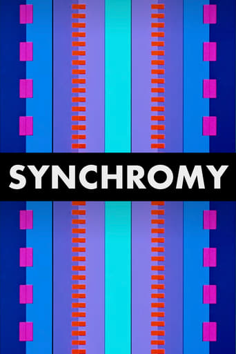
I must say up front that although I have seen quite a few of Norman McLaren's films, I am NOT a fan. Many of these shorts are very experimental in nature and are just not that accessible to the average person. Instead, many appear to be the sort of films you might see in a modern art museum....a VERY modern and unconventional art museum. While all this would DEFINITELY apply to "Sychrony" as well, there was definitely something hypnotic and amazing about the film. As an experiment, McLaren created a musical composition using various size and shapes on the sound track on the edge of film--causing strange mechanical music. These shapes are also shown on the screen in a wide range of colors. It's quite bizarre but also something to see--as you wonder at McLaren's originality and the haunting (yet weird) style. Worth seeing once if you don't mind the unusual.
Tim Reed
The plot synopsis says the visuals are an "artistic representation of the sound track".I'd venture to say that the visuals ARE the soundtrack, optically printed into the frame. The frequencies look correct, and the widths look like normal 35mm soundtracks. Given that McLaren often hand-painted his soundtracks, this would not be too far a stretch. It would have been a simple matter to use an optical printer and expose the tracks in the picture area of the film. This was my first thought when viewing the film. I can't imagine him painting the soundtrack, and then going back and making pictures over again to "represent" the track, when the artwork was already there for the taking.
sirarthurstreebgreebling
McLaren mixes coloured horizontal bands of varying width (depending on the tibre of the music) across the screen. Albeit basic visuals he mixes visual pace with sounds represented by thin and thick stripes ,it looks like how you would imagine hard drives to sound like when processing information. Great stuff
