Imdbidia
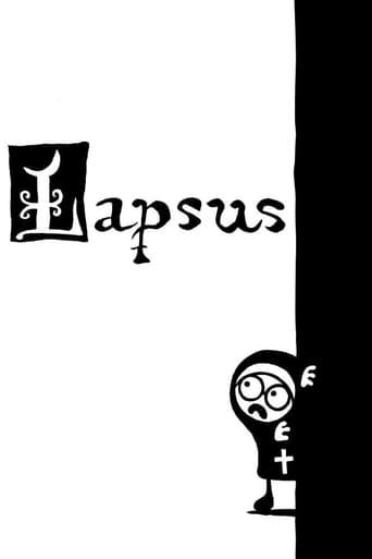
Lapsus is a very short animated film, shot in a bold black-and-white. This is both a comedy of the absurd and an artistic exploration of the narrative possibilities of geometry and colour play. The Argentinean Zaramella does something extremely difficult -- he creates a great short out of simple 2D traditional monotone animation, simple and funny enough to be enjoyed by both children and adults, but quite complex in its conception and playfulness of color and shapes. There is a mix of absurdity and playfulness that is really refreshing. The film is very imaginative, unpretentious and funny. A proof that you just need of a good idea, and a good visual realization to create a fantastic short, no computer generated images necessary.
Rectangular_businessman
"Lapsus" was a cute and funny short black and white (And I mean, literally Black and White, without a single shade of gray)animation from Argentina, which makes a clever use of only two colors and one single character.It was very enjoyable to watch, and the idea was pretty well executed.The animation is simple, but appealing and cute.The main(and the only) character was endearing and very likable."Lapsus" is the perfect example of how some technical limits can be done in a clever and artistic way, resulting in a something pretty satisfying to watch.
RResende
Geometric animation (animated geometry?). It's amazing how simple ideas have a greater capacity to engage audiences. That is if they are really simple with, at the same time, interesting (and many times rather complex) ideas behind them. This is one of those cases. As i write this, i don't know yet the prizes in Cinanima 2007 (where i got to see this short) but it wouldn't surprise me if this little piece got the public award. It's basically an exploration of the possibility to create different images out of similar shapes. The story moves on from the interaction of those images, based on the same pure shapes but which get antagonist meanings, as they pass from the left side of the screen (white) to the right side (black). The humor is born when the director plays with religion in an uncompromising harmless way.Check this, it's a really good experience.My evaluation: 4/5 http://www.7eyes.wordpress.com

