BA_Harrison
A serial killer known as The Doctor (Stephen Rea) is streaming his gruesome handiwork live over the internet for the entertainment of twisted individuals. Meanwhile, the spirit of one of The Doctor's previous victims has set up her own online torture portal (don't ask me how), punishing those who are tempted to watch by killing them 48 hours later. New York cop Mike (Stephen Dorff) is on the case, aided by Department of Health worker Terry (Natascha McElhone).Director William Malone gave us the entertaining 1999 remake of House on Haunted Hill, but his follow-up, Feardotcom, is far less satisfying: the plot is wholly unoriginal (it's basically The Ring, with a website instead of a video, plus a bit of torture porn), the convoluted script is a mess, the performances are weak, and the whole affair is given an aesthetic guaranteed to get my goat-trite blue and orange palette, rapid editing, and lots of dark imagery with flickering lighting (just like 90% of horror films from the same decade).In the film's most ridiculous scenes, both Mike and Terry visit feardotcom.com (why the double .com? See IMDb's trivia for the lame reason) despite being well aware of what will happen to them in two days' time. That's dedication beyond the call of duty, but also pretty damned stupid. As is this film.
NateWatchesCoolMovies
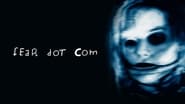
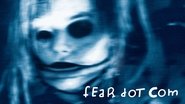
FearDotCom is a thoroughly lazy, deeply awful hunk of excrement. What makes it so bad is the sheer potential of its concept, squandered on a brain-meltingly generic serial killer story that we've all seen hundreds of times. After a rainy prologue (the whole thing seems to take place in a perpetual monsoon) involving a short lived and painfully underused Udo Kier, we're told that multiple victims have begun to disappear 48 hours after logging on to some freaky website called fear.com. The rest of the film could have gone a bunch of different cool and inspired ways, but nooo… instead it plods along with a Detective (Stephen Dorff) and a sanitation worker (Natasha McElhone should know better than to take a second look at scripts like this) as they hunt the proprietor of the web domain, a nasty yet ultimately boring murderer played by Neil Jordan's thespian of choice, Stephen Rea, who also should know better than to wander into this mess. Now, all that could be forgiven, seeing as how potential is pisssed away every hour in Hollywood, it's just par for the course. But where the film really, truly messes the bed is it's DVD art. I remember specifically avoiding the aisle that housed this flick back in the days of blockbuster, because the images on the cover were so uniquely scary. There's a horrific looking mannequin girl, dead bodies arranged in a way that would give Dali nightmares and just a general uneasy look to the box. Thing is, none of that stuff actually shows up in the film anywhere. It's either a con job, butchered editing or the industry's hugest distribution error. For years I was petrified by those images, only to finally get a chance to see the thing, and go: "This?! This is the film that that wickedly memorable horror show of a cover advertised!? Weak…" All we get out of it is a dour, boring, barely conscious bottom of the barrel shocker outing that leaves no lasting impression whatsoever. You're better off buying the DVD, whipping the disc off your balcony like a frisbee and framing the cover on the living room wall to freak your kids out.
Steve Buyer
With a whopping 3% on Rotten Tomatoes and a 5 mil. opening weekend, that says a lot about Feardotcom. With such eerie promotion coupled with a unique premise, one can only wonder why audiences did not visit the site.Feardotcom revolves around the death of a man involved in an alleged unsolved murder. The man appeared to have seen something before he met his demise. What did he see? How did this projection get there? Detective Mike and scientist Terry team up to find the murderer or shall we say "host", but in order to do so they must embark on a website that kills its viewers within 48 hours.With that plot, you would think it would be easy for screenwriter Moshe Diamant to make sense of the film. Unfortunately, that is not the case. A recurring white ball bounces back and forth and left to right with no reason. An inaudible voice is uttered from a house phone with no thought as to whose voice it belongs to. Not even the website makes sense. From the first shot to the last, it is blatant that more thought was given to the production than the script (and oh how stellar some of the hallucinatory sequences look on cellulite). Aside from a nonsensical script, the dialogue is so on the nose you would fancy why Mike or Terry never had the urge to scratch theirs. Although, the film starts off interestingly enough. The title montage is quite ominous and effectively done. Not to mention the opening scene. The train station is so deathly quiet you could almost hear cells dividing. By the time the passenger meets their fate, you cannot help but keep watching even though you know the impact beforehand. However, it would help if the film was as strong as the opening. What I will say is that Feardotcom is consistent with its suspense. There is never a scene that is terse or abrupt in creating atmosphere. Not a single room is well-lit and each minute you go down it, you feel the terror of every second. Honestly, I feel if the film were a short movie, my rating would be higher. When the characters do not speak, we have a winner. When the brightness is lowered and the apparitions take center, you cannot help but look. Unfortunately, the film has this exposition that is just pompous and unnecessary. We want to see more of the website- not see the maker of the site, and then hear the antagonist's spoon-fed motive. In brief, Feardotcom does not deserve the 3% on Rotten Tomatoes. Technically, the film is superb. It has a nice blue hue and the rain looks pretty. I cannot say the same about the script though, which is why some of the negative feedback is deserved. If you choose to visit Feardotcom (not like the rest of the United States), you will be treated to some creepy and fascinating imagery. But if you choose not to visit the site, you would have probably made the right choice.
kdsteel1234
I brought this today with not looking at the reviews on here as i now try not to be influences by what people say before i watch the film, so when i did finally come on here to read the comments I was astonished to find it was rated so low. This is similar to Untraceable about the Internet and what its potential can cause somebody , This had the potential to be such a great film as there was a good story and background but the ending ruined it for me so crappy Nothing remotely scary about it If you wish to view it then do There's nothing wrong with it just not as good as it could be So because of the horrible ending And minor scary effects I rate this A 4 overall


